A great contact us page can make big difference in turning visitors into customers or clients. Contact us page examples show how simple design, clear information, and an easy-to-use form can come together to create a user friendly website for people to reach out. Whether someone has a quick question or has a bigger problem, the right contact page helps to make that connection with visitors.
In this article, we’ll look at 20 inspiring contact page examples including sample contact us forms and real website examples that you can learn from. Not all contact us pages are good some are cluttered or confusing, but these examples show how clarity and thoughtful design can help you build trust and encourage more people to get in touch.
Table of contents
What makes a good “contact us” page?
When someone wants to get in touch, and your contact page is the place they’ll go. A good one makes it simple—no confusion, just an easy way to connect. Here’s what makes a contact page really work:
1. Clear and Simple design
Contact us page should be easy to navigate. Always keep the layout clean and clutter free. Use clear headings, plenty of white spaces and a layout that guides user without making them confuse.
2. Straightforward Copy
Good contact us page text samples speak directly to the visitor. Keep your words clear and easy to understand. But, it’s important to help visitors know what to do and what will happen after they contact you.
3. Easy-to-Use Form
A sample contact us form typically includes just the essentials—name, email, and a message field. A contact us page should not be complicated. Asking for only the things that you need is beneficial.
4. Multiple Contact Options
Different people have different ways to get in touch. some prefer calling, while others like to email or message. Thus, giving them multiple contact options, like a phone number, email, form, or social links. Making them choose what is best for them.
5. Strong Call to Action (CTA)
Tell people exactly what to do next with a clear CTAs like “send a message” or “get in touch”. A little bit of push is all a visitors needs.
Examples of the Best Contact Us Pages
1. Unbounce
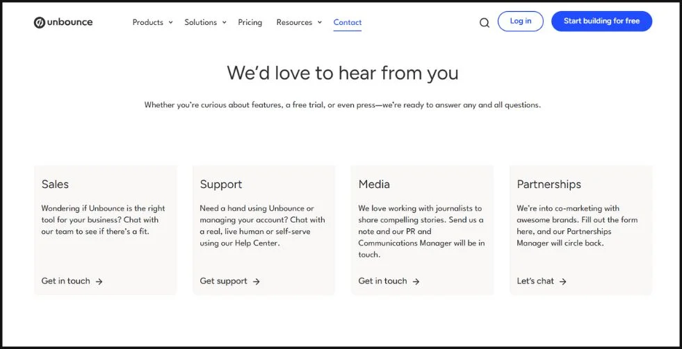
Unbounce offers a great example that shows how a contact us page can simple and effective. The clean layout, with easy navigation and clear paths for users to connect with the right team. The page includes a smart chatbot that asks for your email to keep the conversation up, this is a great contact us form example.
The contact form is minimal and has only the essentials details making it easy and quick to fill out. This sample contact us form shows how a website can make communication feel effortless and more personal. This is a example of a contact us page that balances simplicity with function. For SaaS companies this is one of the best contact us website examples to learn from.
2. Zendesk
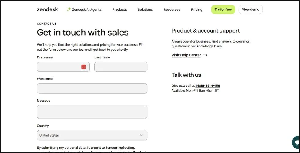
Zendesk showcases how simplicity and clarity can enhance the user experience. Instead of overwhelming visitors with a complex contact us form, this page offers two clear, focused paths: one for contacting the sales team and another for accessing product and account support via the Help Center or phone.
This simple layout helps users quickly find what they need whether it’s pricing, product help, or general support. The layout is clean and modern, with a bold “Contact Sales” button that stays visible, encouraging immediate action.
Zendesk’s page stands out as one of the best contact us page examples, combining smart design with functionality. It’s a powerful contact us website example that shows how minimalism can still deliver a strong, user-friendly experience.
Check out: 12 Interactive Website Examples That Will Wow & Inspire You
3. KeySmart
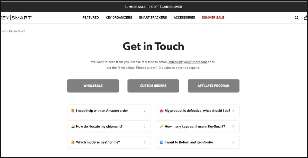
KeySmart’s contact page stands out as one of the most thoughtful and user-friendly designs out there. It’s clean, easy to navigate, and shows how a brand can remain both approachable and efficient. The layout is simple and intuitive, guiding users straight to the information.
What makes this page truly effective is its clarity with a well-structured form that asks only for essential details, making it quick and hassle-free to reach out. It’s a great example of a contact us page that balances function and friendliness, perfect for brands that want to offer a personal yet professional touch.
If you’re looking for inspiration for your own site, KeySmart’s page is a great reference point for building a clear, accessible, and well-organized contact experience.
4. Quince
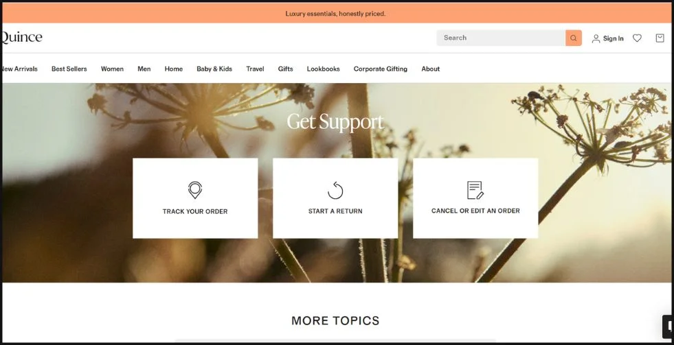
Quince offers a well-organized, user-first contact page that makes getting support effortless. Whether you need to track an order, start a return, or cancel or edit an order, everything is clearly laid out right away in a few clicks.
What sets it apart is how it respects your time. The design is clean, the instructions are clear, and the options are tailored to what most customers actually need. It’s a great sample contact us form that reflects both efficiency and care.
If you’re searching for modern, customer-focused contact us form examples, Quince shows how to deliver helpful service with minimal effort on the user’s end.
Check out: Top Landing Page Examples With Best Designs In 2025
5. Nike
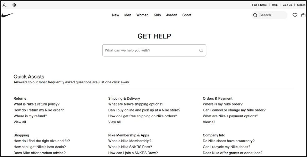
Nike makes getting help easy. Their contact page starts with a search bar, so you can quickly find answers without digging through menus. Right below, everything’s neatly organized whether you need help with returns, shipping, payments, or your Nike membership.
It’s built to save time and reduce frustration, with 24/7 live chat and other support options just a click away. This is one of those contact us website examples that feels effortless and clear, no matter how you choose to reach out. If you’re looking for a clean, helpful example of contact us page design, Nike is a great one to learn from.
It respects your time and gives you control over how you want to connect. The whole experience feels less like “customer support” and more like helpful problem-solving.
6. YETI
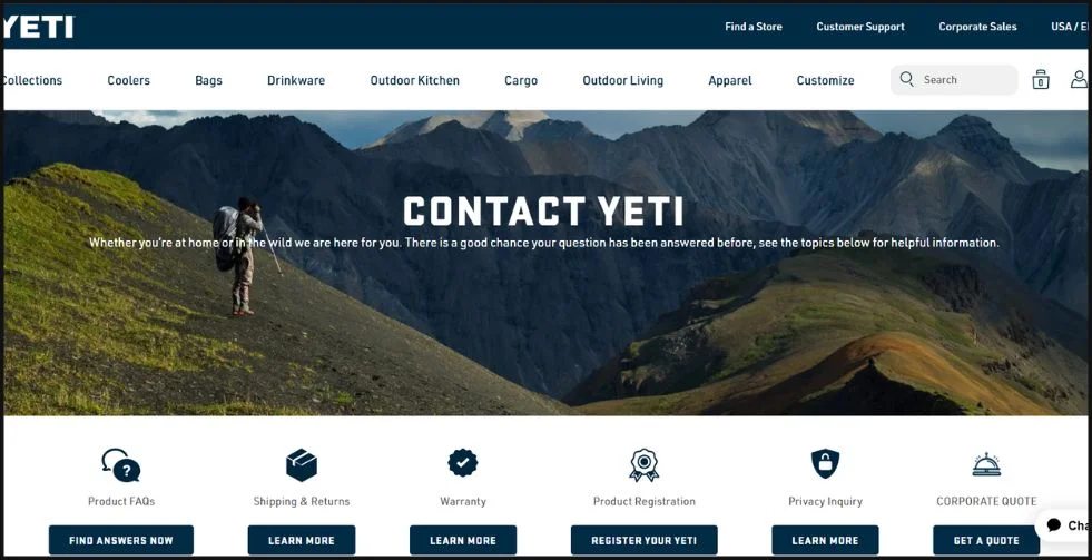
YETI’s contact page is a great example of smart, user-friendly organization. Whether you need help from customer support, want to request a corporate quote, or need to file a warranty claim, everything is just a click away. The layout separates key areas like product FAQs, shipping & returns, and registration. So visitors can quickly find what they need without digging around.
It’s especially useful for brands serving both retail customers and corporate clients. With clear buttons, labeled sections, and a clean design, YETI makes it easy to take action without feeling overwhelmed. This is one of those contact us page text samples that shows how structure and clarity can lead to a better customer experience. If you’re reviewing examples of contact us pages that balance professionalism with ease, YETI’s is a solid one to learn from.
Check out: Best Website Footers: Top 15 Creative & Functional Designs
7. Grammarly
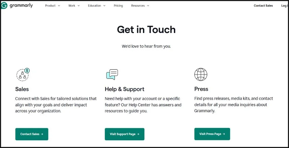
Grammarly’s contact page shows just how easy and helpful support can be. Everything’s clearly laid out whether you want to ask a question, manage your account, fix a technical issue, or leave feedback, it’s all right there without any confusion.
The contact us form example is simple and quick to use, with just the essentials you need to get help fast. It’s not overloaded it feels like it was made for real people, not just support tickets.
Grammarly’s page is a great reminder that customer support doesn’t have to be complicated to work well. It’s one of those contact us page examples that makes the whole process feel easy, personal, and stress-free.
8. Moz
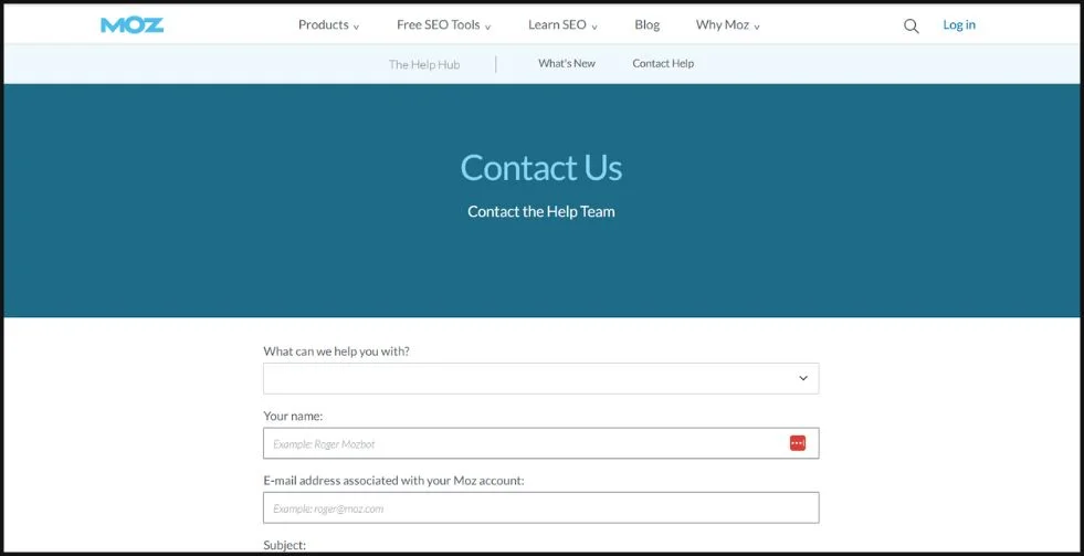
Moz keeps things simple and thoughtful on their contact page. Whether you’re looking to talk to sales, get help from support, or just ask a general question, you’re guided straight to the right spot.
The contact us form example is short and straightforward. It only asks for what’s necessary, so it’s easy to fill out and doesn’t feel like a chore. As a great website contact us page example, it shows how a brand can stay professional without feeling distant. Everything about it feels easy, clear, and built to help you get what you need quickly.
Check out: 5 Must-Have Elements of a Complete Ecommerce Product Page
9. Adobe
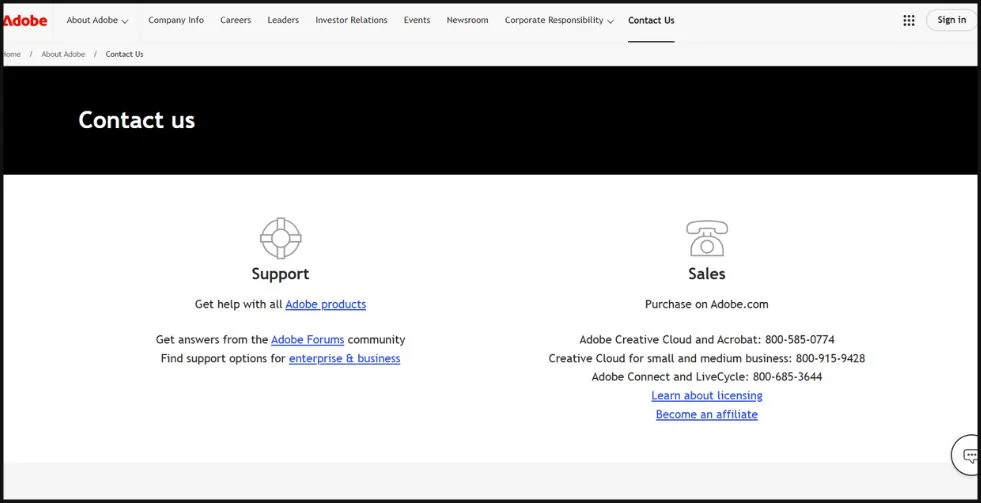
Adobe’s contact page makes it easy to find exactly what you’re looking for. Whether you need help with your subscription, want product support, or are requesting a demo, the page guides you smoothly with clear options and easy navigation.
The contact us form example is tailored to your specific need and a well-designed, simple to use, and free of distractions. It feels like Adobe really thought about what users actually need.
As one of the most polished contact us page examples, it shows how even a big brand can make a complex support system feel elegant and user-friendly.
10. Impact
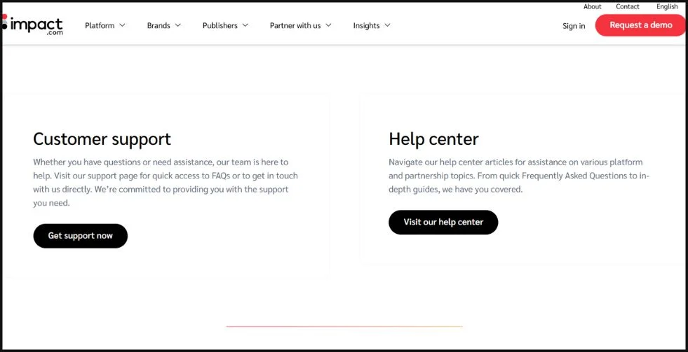
Impact’s contact page starts with a simple, welcoming question: “How can we help?” It sets the tone for a support experience that’s clear and focused. Whether you’re reaching out about partnerships, sales, or technical issues, the page separates each topic into its own form saving you time and avoiding confusion.
The sample contact us form is short but covers all the right details, making it easy to get your message across. Everything feels intentional and efficient.
As a performance marketing platform, Impact shows that speed and clarity can go hand in hand. It’s a strong example of how to build a contact page that’s both helpful and thoughtfully designed.
Check out: 20 Best Homepage Designs That Nail First Impressions
11. Marvel
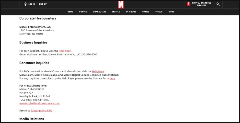
Landing on Marvel’s contact page feels exactly how you’d expect from a design-first company—clean, thoughtful, and on-brand. The page offers sleek, well-labeled sections for support, enterprise inquiries, and press, all styled to match Marvel’s visual identity.
The contact us form example is short, friendly, and gets straight to the point, making it easy to reach out without any friction. It’s simple without feeling impersonal.
This is a great contact us website example for SaaS brands looking to blend creativity with usability. Marvel proves that a contact page can be both beautiful and practical, without sacrificing either.
12. Sleeknote
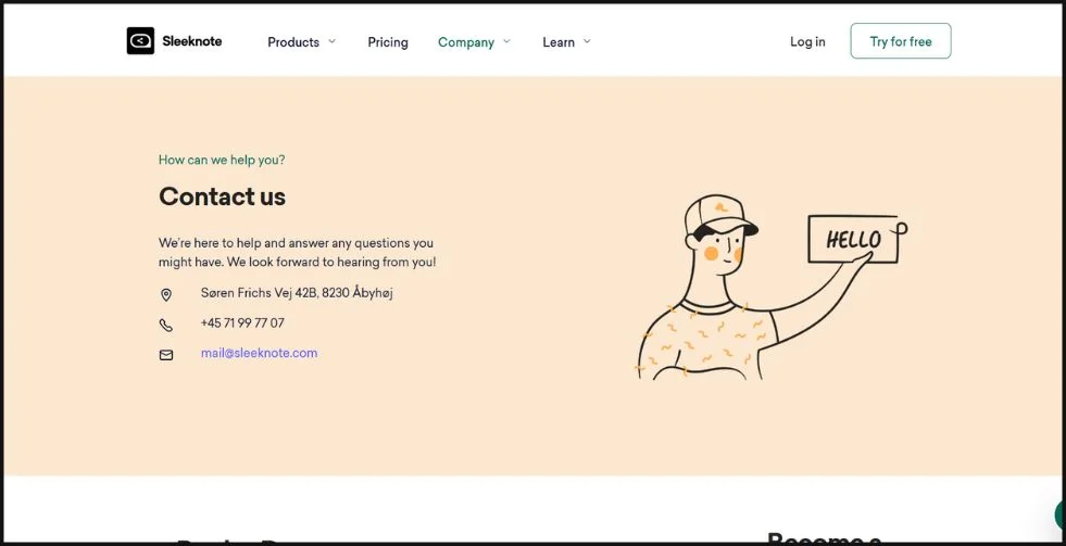
Sleeknote welcomes visitors with a friendly, helpful tone – How can we assist today?” Right away, you’re given clear options to choose from, whether you’re booking a demo, exploring a partnership, or reaching out for support.
The sample contact us page keeps it simple with a short form that asks only what’s essential: your name, email, and message. It’s quick, focused, and easy to use.
For brands that want to keep things clear and user-friendly, Sleeknote is a great example of how to do it right.
Check out: Web Design Basics For Crafting A Beautiful & User-Friendly Site
13. Slack
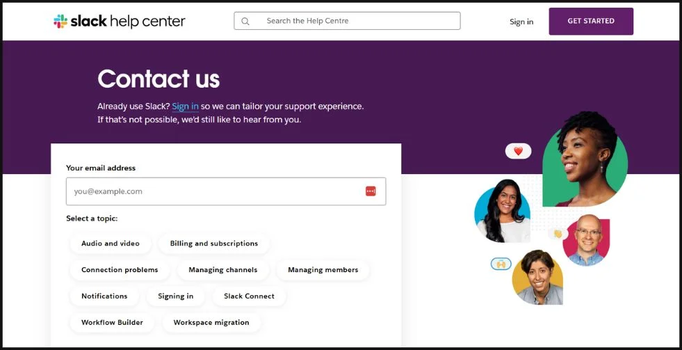
Known for redefining workplace communication, Slack brings the same clarity and ease to its contact page. It feels less like filling out a form and more like messaging a helpful friend. The page gently guides you toward the right kind of help whether that’s bot-powered assistance, enterprise support, or general questions with clear, well-organized options.
The contact us form example is refreshingly simple, asking only for the essentials to get the conversation started. No clutter, no confusion just a quick, friendly way to reach out.
As a contact us website example, Slack shows how even a corporate platform can stay approachable and personal. It’s proof that support can feel human, even in a highly digital space.
14. LinkedIn
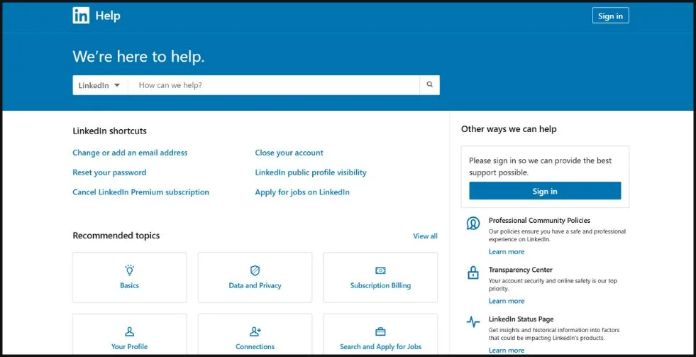
As the go-to platform for professional networking, LinkedIn brings the same organized, no-nonsense approach to its support experience. When you visit LinkedIn’s support area, you feel in control from the start. Everything’s neatly organized—whether you need help with your account, advertising tools, or something else, the sections are clearly labeled and easy to navigate.
The example of contact us page here is simple and focused, asking only for the essentials so you can get help and move on quickly. It’s a great model of how B2B platforms can stay efficient while still feeling approachable.
Check out: How To Design Business Web Apps
15. American Express
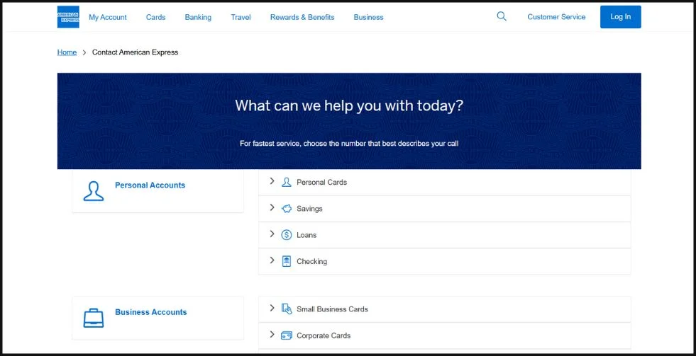
As a global leader in financial services, American Express knows the value of reliable, customer-first support. It welcomes you with a sense of reassurance you immediately feel like you’re in good hands. The page offers multiple ways to get support, including live chat, phone assistance, and secure forms for billing questions, disputes, and other account needs.
The contact us form example is clear, easy to use, and built with privacy in mind—exactly what you’d expect from a trusted financial brand. It’s a great model of how to deliver support that’s both professional and personal.
16. HubSpot
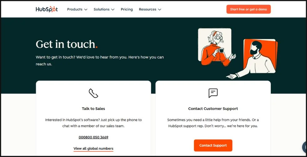
HubSpot’s contact page feels like stepping into a helpful workshop organized, welcoming, and built to guide you in the right direction. It offers clear channels for booking a demo, reaching sales, or submitting a support ticket, so you’re never stuck in the wrong queue.
The sample contact us form is thoughtfully tailored to each request type, asking only what’s necessary without overwhelming you. It’s efficient, friendly, and gets you where you need to go.
As one of the best examples of contact pages done right, HubSpot proves that segmentation and simplicity can work hand in hand.
Check out: 25 Examples Of eCommerce Website Design To Get Ideas From
17. Apple
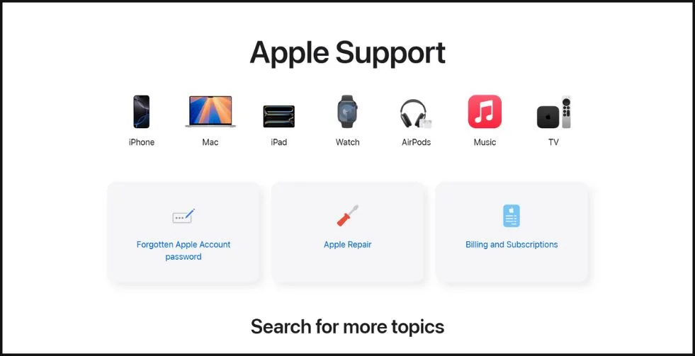
Known for its seamless user experience, Apple brings that same thoughtful design to its contact page. It welcomes you with crisp elegance and an intuitive layout that’s easy to follow.
Whether you need help with a device, a repair, or a recent purchase, you’re guided clearly no clutter, no confusion. The contact us form example is minimal, often replaced or supported by direct chat and call options to speed things up.
As a standout contact us website example, Apple shows how you can deliver fast, efficient support without sacrificing design or simplicity.
18. Medium
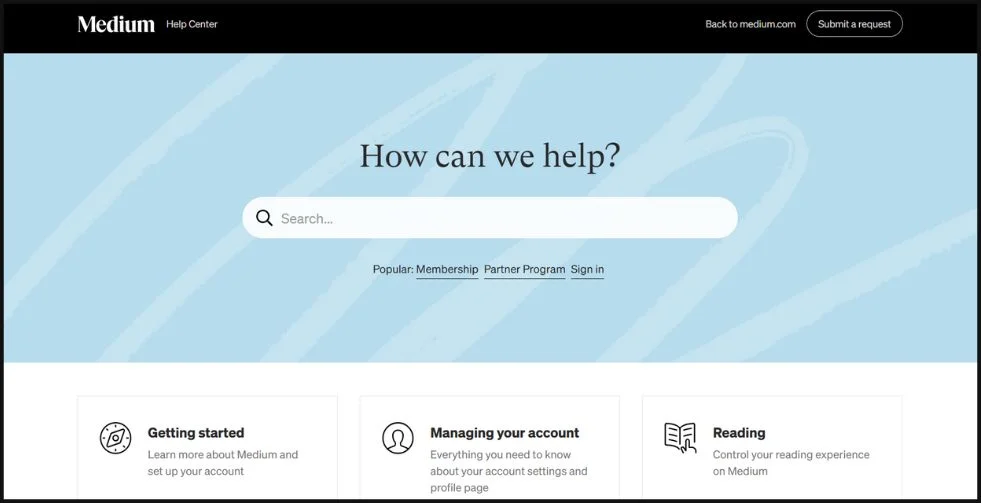
As a platform built for thoughtful content, Medium brings that same clarity and calm to its contact page. It keeps things simple, and the experience feels refreshingly direct.
This sample contact us form handles feedback, press, and partnership inquiries all in one place without any distractions. The tone is polite and approachable, and the layout makes reaching out feel easy and natural.
If you’re aiming for a minimalist, no-fuss contact approach, Medium offers a quiet lesson in doing more with less.
Check out: Impact of Slow Loading Website and How to Fix It
19. Accenture
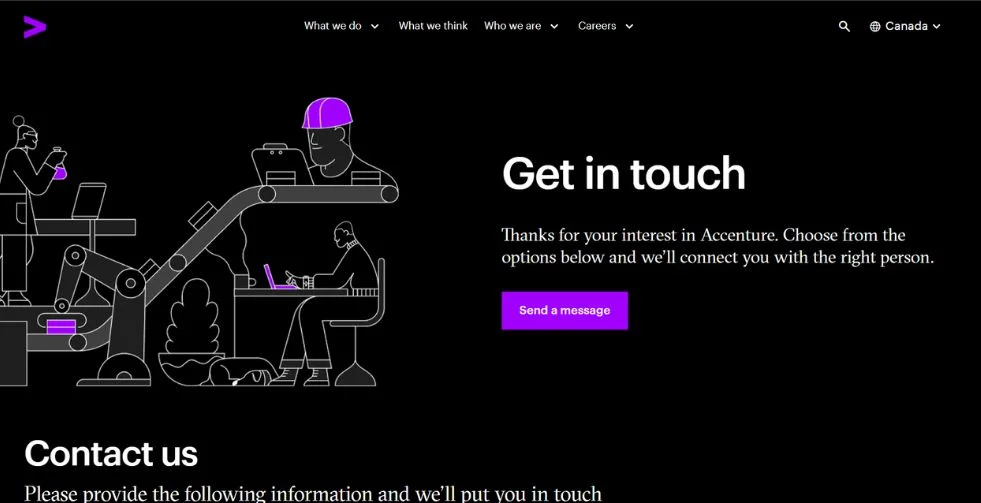
As a global leader in consulting and technology, Accenture creates a contact experience that feels both expansive and tailored.
This example of contact us page begins by helping you select your region and purpose whether it’s sales, careers, or media so your request reaches the right team. The form is focused and professional, offering clarity without friction.
It’s a great model for brands that serve international audiences while keeping the user journey smooth and relevant.
20. Houzz
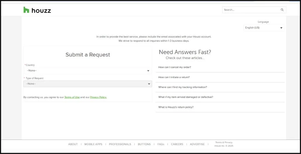
Houzz strikes the right tone from the start welcoming both homeowners and professionals with clarity and ease.
This contact me page example offers tailored paths depending on who you are and what you need, from getting a quote to solving an issue. The form is polite and focused, asking only what’s necessary to move things forward.
In the home design space, Houzz sets a strong standard with a contact page that’s thoughtful, organized, and easy to navigate.
Check out: How To Create a Good User Interface: 15 Essential Tips for UI Designers
What These Contact Us Page Examples Teach Us
After going through these contact us page examples, one thing is clear good design goes beyond looks. The most effective pages are built with real people in mind. They offer clear choices, speak in a friendly tone, and remove the guesswork from reaching out.
Whether it’s a clean layout, a well-placed button, or just asking the right questions in a form, each detail helps visitors feel supported. These examples show that you don’t need something flashy just a thoughtful, approachable setup that makes people feel heard. If your contact page makes it easy to connect, you’re already halfway to building trust.
Frequently Asked Questions For Contact Us Pages
1. How many fields should a contact form have?
Less is more. A good sample contact us form typically includes just 3 to 5 fields—like name, email, subject, and a message box. Keep it simple to avoid overwhelming users, and only add extra fields if they truly help qualify the inquiry.
2. What should I include besides the form?
Beyond the form, your contact us page should include key business details—like your phone number, email address, physical location (if relevant), social media links, and office hours. A friendly message or short contact us page text sample can also make the page feel more personal and trustworthy.
3. Is a contact form better than listing an email address?
In most cases, yes. A contact us form provides a smoother experience for users and is less likely to attract spam than a visible email address. It also helps you organize and track incoming messages more efficiently.
4. Can I customize contact us page examples for my industry?
Absolutely! Every industry has different needs, and your page should reflect that. These contact us page examples are meant to inspire you but the best results come when you tailor the design, messaging, and form fields to suit your brand, audience, and communication style.
Final Thoughts On The Best Contact Us Page Examples
The one thing all great contact us page examples have in common is that they put the user first. From clean layouts and smart form design to helpful navigation and thoughtful messaging, these pages don’t just look good but they also work.
In this blog, we explored some of the most effective and inspiring examples out there. Each one, whether from a global tech brand or a growing startup, offered practical takeaways you can use.
Now it’s your turn. Take inspiration from these real-world examples and build a contact page that’s clear, approachable, and aligned with what your audience needs.
If you find this blog helpful, check out more: