First impressions are more important than ever in the digital age. A brand’s website frequently serves as its audience’s initial point of contact. Designers are adopting cutting-edge strategies like parallax scrolling to produce engaging, interactive experiences in order to stand out online. In ways that static websites cannot, the best parallax websites use this technique to engage visitors, tell captivating stories, and add depth.
This article is for you if you want to learn how to make your own dynamic website, comprehend the significance of parallax scrolling, and get ideas from actual examples. We’ll look at the top 20 parallax websites with imaginative scrolling effects and offer advice on how to create fluid parallax interactions.
Table of contents
- What Is a Parallax Website?
- Why Parallax Scrolling Matters: Key Benefits of Parallax Websites
- 20 Best Parallax Websites: Creative Examples to Inspire Your Next Project
- 1. Brand Studio
- 2. Casa Mami
- 3. Holly Bray
- 4. Healthway
- 5. The Goonies
- 6. Fluttuo
- 7. Every Last Drop
- 8. Dogstudio
- 9. Fueled
- 10. Synchronized Studio
- 11. A Fork & A Pencil
- 12. Cuberto
- 13. Jess & Russ
- 14. NBC News
- 15. Canals
- 16. Zion Adventure Photog
- 17. Flatiron Family Medical
- 18. ScrubaDub
- 19. Long Shot Features
- 20. Delassus
- Tips for Creating Smooth and Effective Parallax Websites
- Conclusion
- Frequently Asked Questions (FAQs)
What Is a Parallax Website?
Parallax scrolling is an impressive web design effect, it when you scroll down a page and the background speed is different from the content in the foreground. This little shift creates a feeling of depth, making the site feel layered and almost three-dimensional instead of just flat.
There are many ways to use parallax effects from simple background movements to more complex animations with many layers with combination of text, images, and interactive parts. This makes the site alive and more interesting which attracts more visitors and engage them with creative web designs.
Why Parallax Scrolling Matters: Key Benefits of Parallax Websites
1. Adds Depth and Dimension to Flat Designs
Parallax scrolling can be useful if your website has a clean, simple layout that makes it appear flat or uninteresting. By permitting backgrounds and other elements to move at varying speeds, it adds depth. This enhances the visual appeal of your home page and entices users to explore your website, portfolio, or services.
2. Engages Users Through Interactive Experiences
The way parallax responds to your visitors is among its best features. The website reacts as users scroll, making it an interactive, engaging, and personalised experience. Interactions of this nature can entice readers to peruse your case studies and keep them on your blog for longer. Making guests feel engaged rather than merely passive observers is the main goal.
3. Improves Storytelling and Content Flow
Any website must have a compelling narrative, and parallax scrolling allows you to have more control over how your story develops. You can reveal content to visitors gradually as they scroll rather than bombarding them with it all at once. This facilitates users’ comprehension of your services, team information, and brand image on the about page. The narrative flows naturally when websites use continuous scrolling techniques, which keeps users interested from beginning to end.
4. Captures and Holds Attention
The eye is drawn to movement by nature, and parallax effects provide a subtle means of guiding it. You can highlight your featured projects, draw attention to a pricing page, or guide visitors toward call-to-action buttons. These animated features on cool parallax websites increase the likelihood that visitors will visit your contact page , decrease bounce rates, and hold their attention for longer.
5. Creates a Modern, Sleek Aesthetic
In addition to being useful, parallax scrolling gives your website a sleek, contemporary appearance. It lets customers know that your company appreciates creativity and a seamless user experience. Webflow parallax or other top parallax site effects give your home page, portfolio, and services sections a newer, more polished appearance.
6. Emphasises Important Information and Calls to Action
Websites with parallax scrolling are ideal for emphasising key sections. Blog entries, case studies, exclusive deals, and important call-to-action buttons can all be highlighted. Your visitors will notice what matters most when they explore your home page, read about your brand on the about page, or choose to contact you via the contact page if you use stunning parallax websites as inspiration.
20 Best Parallax Websites: Creative Examples to Inspire Your Next Project
Let’s explore 20 of the best parallax websites that have mastered layered scrolling, combining beautiful visuals with a seamless user experience.
1. Brand Studio
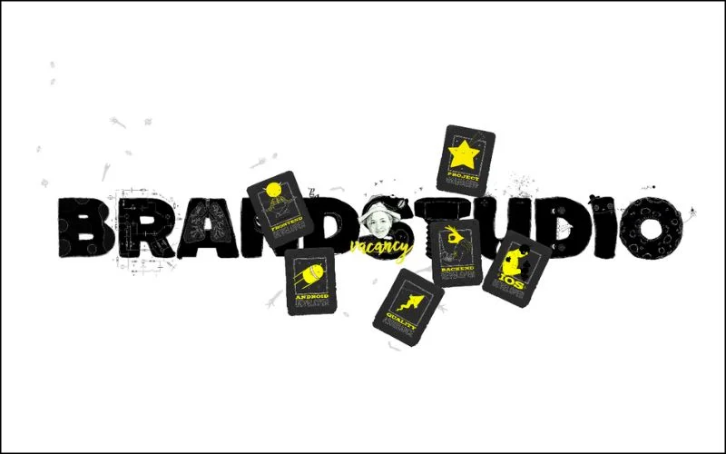
Brand Studio is a unique creative parallax website that showcases projects with clarity and style through layered scrolling and seamless Webflow parallax effects. This website makes sures that users can easily navigate through its portfolio and services by striking a balance between visually appealing motion and a strong visual hierarchy.
With thoughtful intuitive design flow and engaging scrolling website animation, Brand Studio is a great example of how to combine creativity and usability.
Also Check Out: Best Website Footers: Top 15 Creative & Functional Designs
2. Casa Mami
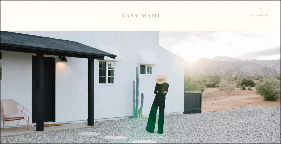
Casa Mami’s minimalist art portfolio comes alive with clean layering and depth in UI design. Each scroll animates background and foreground elements independently, giving artworks a gallery-like, 3D effect.
The use of motion in modern interfaces adds sophistication without overwhelming the clean layout an ideal example of minimalist website design with flair.
3. Holly Bray
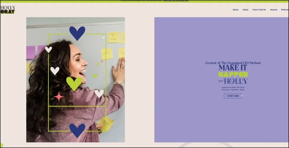
This website is a lively and entertaining display of imaginative layout inspiration thanks to Holly Bray use of vibrant colours and captivating motion. It easy to navigate the content thanks to the parallax animations, which enliven the browsing experience while upholding strong user experience design best practices. In addition to improving the visuals, the motion also strengthens the brand voice.
Also Check Out: How To Create a Good User Interface: 15 Essential Tips for UI Designers
4. Healthway
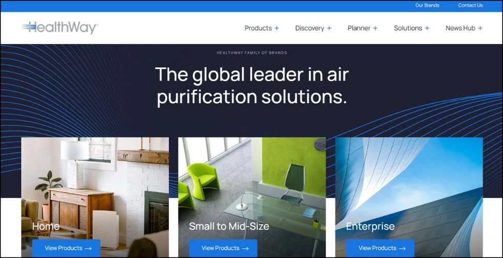
HealthWay makes sure that the focus is always on the health content by combining thoughtful layout with subtle motion. This is an excellent illustration of intuitive design flow, where parallax provides visual interest without detracting from important details. It’s a simple and approachable version of responsive parallax design for websites with lots of content.
5. The Goonies
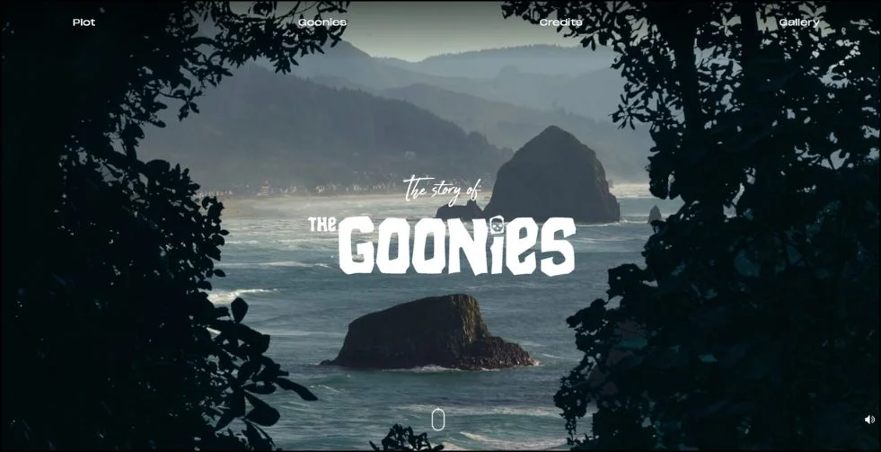
The Goonies site transports fans into iconic movie scenes using layered scrolls and cinematic pacing. Every scroll feels like a different camera angle in this motion-based storytelling.
The user is guided fluidly from one scene to the next by the design’s clear visual hierarchy, even with the layered visuals.
Also Check Out: 10 Best Font Combinations To Elevate Your Typography
6. Fluttuo
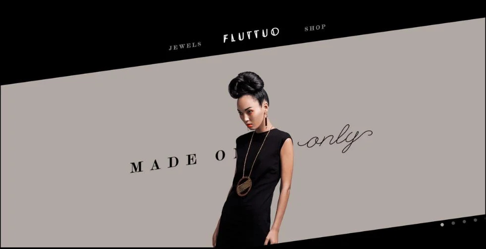
The product showcase from Fluttuo’s a vibrant blend of interaction and animation. Elements move purposefully as you scroll, showcasing scroll-triggered animation that highlights important features. The visual cadence maintains user interest and is a notable illustration of eCommerce animation design.
7. Every Last Drop
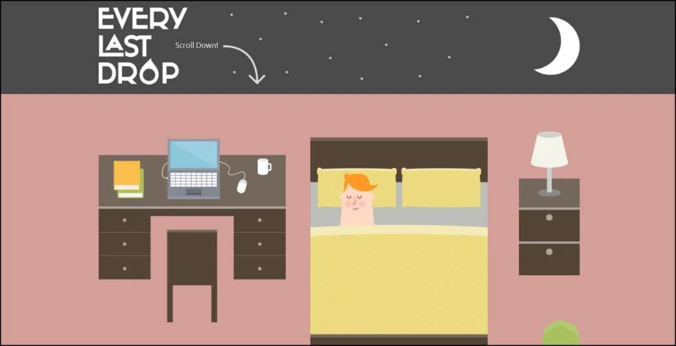
Every Last Drop website reinforces its message with layered parallax and dripping water animations. The design skilfully combines purposeful visual storytelling with animation, which is used to improve understanding as well as for aesthetic reasons. It’s a compelling example of website emotional design.
Also Check Out: 35 Best Free Handwritten Fonts For Crafting Unique Designs
8. Dogstudio
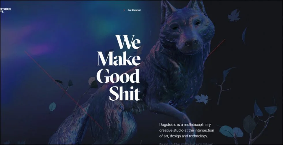
Dogstudio creates a creative agency website design that highlights talent without compromising usability by fusing daring parallax effects with an artistic edge. The motion demonstrates a thorough comprehension of visual hierarchy in web design, complementing rather than competing with the portfolio.
9. Fueled
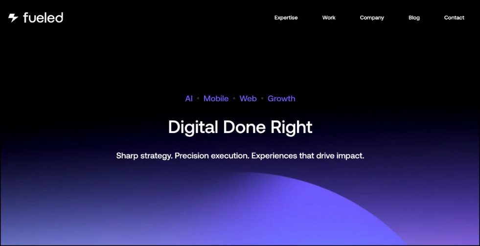
For tech companies, Fueled is the best parallax website available. The agency’s inventiveness is evident in the fluid transitions, dynamic layouts, and deliberate motion.
Additionally, it adheres to best practices for UX design, making the interface user-friendly even with its high level of motion.
Also Check Out: Web Design Business Ideas & Inspirations To Fuel Your Passion
10. Synchronized Studio
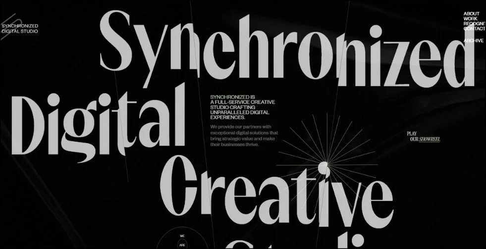
Soft parallax is a subtle and elegant way to showcase projects on the Synchronized Studio’s website uses soft parallax to highlight projects with elegance. The site maintains a feeling of professionalism and serenity throughout, and the transitions feel deliberate and in line with minimalist website design principles.
11. A Fork & A Pencil
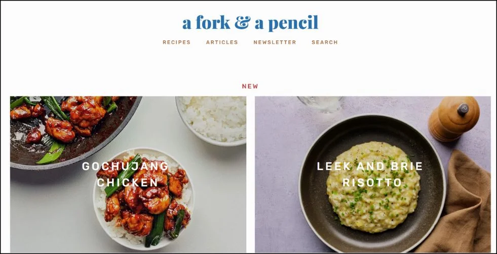
A fork & a pencil demonstrates motionless minimalism. Light parallax animations, gentle colour schemes, and clean typography combine to produce a seamless, distraction-free user experience. This model is excellent for employing scroll-triggered animation without overpowering the user interface.
Also Check Out: 15 Ultimate Guide to Best AI-Powered Logo Generator Tools
12. Cuberto
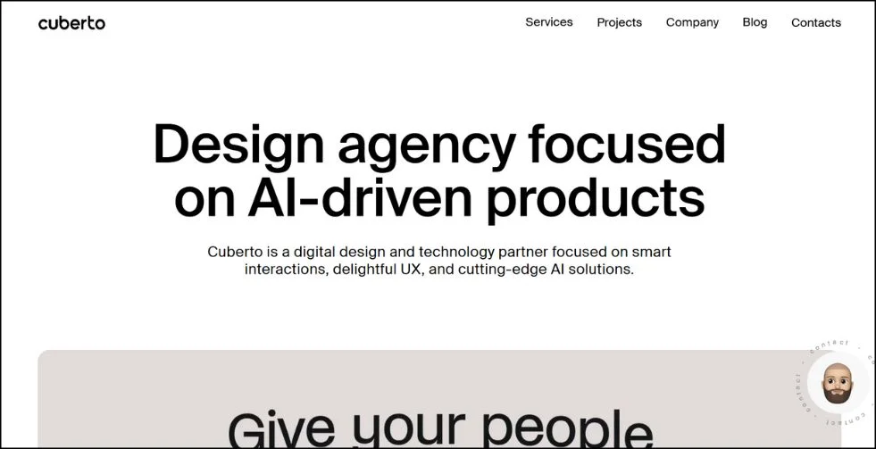
Cuberto’s website is slick, quick, and has a lot of scroll effects that blend together naturally. It is a standard for interactive portfolio websites since each component has a functional or aesthetic function. Its use of Webflow parallax animation demonstrates how creativity and technical process work together.
13. Jess & Russ
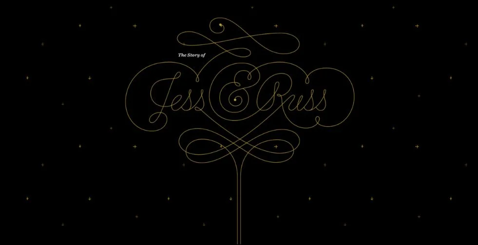
Jess & Russ uses layered images and personal touches to tell a love story. It is a superb illustration of scroll storytelling since the parallax scrolling adds warmth and emotion. Website layouts that invite users into the story are a reflection of emotional design.
Also Check Out: Adaptive Vs. Responsive Design: What Is Best For Your Site?
14. NBC News
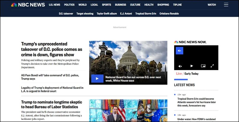
In order to create a contemporary and captivating layout, NBC News mploys parallax scrolling to break up lengthy content. To support user experience design best practices for readability and information flow in publishing, layered graphics and motion highlight important points.
15. Canals
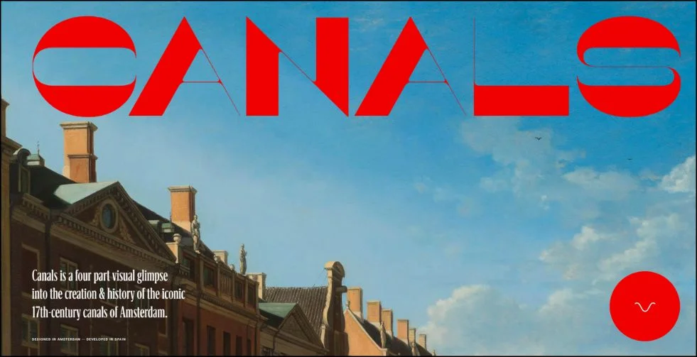
Canals uses vibrant animated parallax layers to create the impression of a city in motion. A dynamic experience is produced by urban imagery, changing backgrounds, and delicate zooms.
This is the ideal illustration of how motion is used in contemporary interfaces to communicate the energy and tone of a brand.
Also Check Out: 25 Examples Of eCommerce Website Design To Get Ideas From
16. Zion Adventure Photog
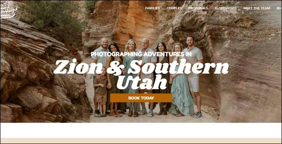
To highlight breath taking landscapes and poignant photo sessions, Zion Adventure Photog employs strong full-screen images and soft parallax transitions. An intimate experience is created as users scroll, allowing images to gradually come into view and content to gradually unfold.
Layering and depth in UI design enhance the site’s emotional design and give users a sense of immersion. It’s a powerful illustration of scroll storytelling, particularly for outdoor creatives and personal brands.
17. Flatiron Family Medical

Soft colours, approachable typography, and delicate scroll effects are all used by Flatiron Family Medical to create a simple, friendly approach to healthcare. The website’s user-friendly design flow helps users navigate through its services, patient resources, and contact details.
While adding depth to sections and images, parallax scrolling doesn’t detract from the content. It’s a great illustration of how serious, information-heavy industries can still use parallax scrolling websites while following best practices for user experience design.
Also Check Out: Top Web Design Trends Shaping The Future of the Internet
18. ScrubaDub
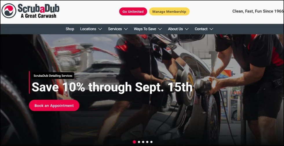
With its whimsical animations, amusing icons, and lively motion in contemporary interfaces, ScrubaDub’s entertaining website makes car washes come to life. To keep things entertaining, parallax elements change, bubbles rise, and cars zoom as you scroll.
The website keeps a strong visual hierarchy despite its whimsical feel, which makes it simple for users to locate services or locations. It’s a neat parallax website that strikes a balance between usefulness and fun.
19. Long Shot Features
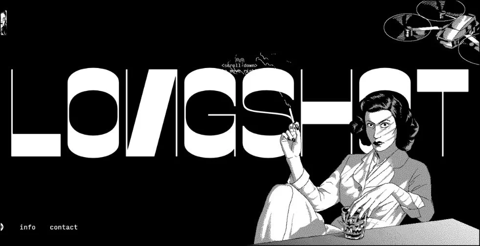
Long Shot Features is a website with a strong cinematic design that focusses on films. It creates a narrative experience that resembles a movie trailer by utilising dramatic parallax movement, moody colours, and large visuals.
The layered scrolling techniques enhance the mood without degrading usability, and the transitions are intentional. It’s a great choice for imaginative parallax website inspiration and visual storytelling.
Also Check Out: 15+ Powerful Reasons Why Are Logos Important (Plus Expert Tips!)
20. Delassus
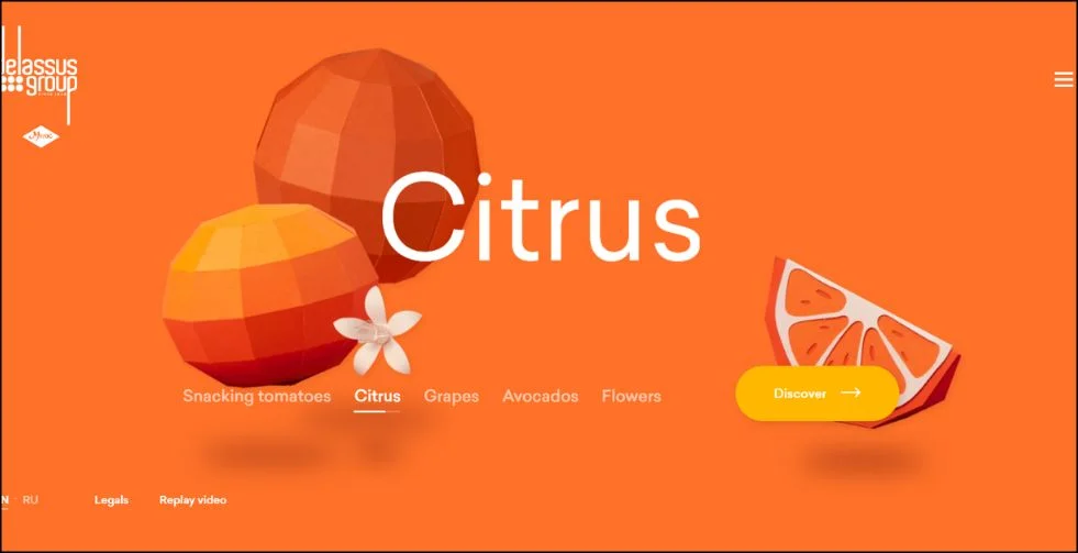
Delassus showcases its premium produce brand by combining beautiful Webflow parallax background effects with artistic photography. A sophisticated digital presence is produced with each scroll, which displays full-width images layered with soft motion.
Using whitespace and scale to highlight quality and craftsmanship, the layout is modelled after minimalist website design examples. This is a classic example of branding using emotional design.
Tips for Creating Smooth and Effective Parallax Websites
To make your parallax website visually appealing and user-friendly, keep these best practices in mind:
- Make sure your animations are subtle and fluid.
Steer clear of overpowering visitors with quick or disproportionate parallax effects. Users are better able to concentrate on the content when the movements are fluid and understated. - Optimize Images and Media
Always optimize images to cut down on load times without sacrificing quality, use compressed images and contemporary formats like WebP. Websites that load quickly enhance both SEO and user experience. - Test Across Devices and Browsers
Desktops, tablets, and smartphones may display parallax effects differently. Make sure that everyone can use your design, even those using outdated browsers. - Use Parallax Strategically
Use parallax scrolling to draw attention to important information, like calls to action, product features, or narrative points. - Maintain Clear Navigation
Usability should improve with parallax, not hinder it. Keep menus easy to access and visible, and avoid confusing scrolling. - Balance Visual Impact and Performance
Generally, parallax effects can slow down your site. Use lazy loading, minimize unnecessary scripts, and streamline animations to maintain speed and responsiveness.
Conclusion
The best parallax websites combine artistic creativity with technical skill. They create engaging user experiences that are both beautiful and useful. Parallax scrolling provides a strong way to add depth, improve storytelling, and connect with visitors more than traditional designs.
Tools like Webflow and Wix, make amazing parallax website easier than ever. By learning from the inspiring examples listed above and following expert design tips, you can build a site that stands out in 2025 and beyond.
Frequently Asked Questions (FAQs)
1. What is a website that uses parallax?
In order to give the impression of depth and motion, parallax websites employ a scrolling effect in which background elements move more slowly than foreground content.
2. What are websites with parallax scrolling?
These websites have scroll-triggered, layered animations that improve storytelling and interaction.
3. Can I create a parallax website on Webflow or Wix?
Yes! Both platforms provide tools and templates to build beautiful parallax sites without coding.
4. Which platforms support parallax effects?
Besides Webflow and Wix, WordPress (with plugins), Squarespace, and custom-coded sites support parallax scrolling.
5. How do I make my parallax website load faster?
Optimize images, minimize scripts, use lazy loading, and regularly test your site’s performance.