A landing page is an initial page someone reaches through a search engine, an ad, or an email, depending on the source. A landing page has one primary action it aims to get the visitor to perform, such as signing up, making a purchase, or downloading a guide. Making somebody stay or driving them away is a typical challenge for any landing page.
A landing page with the best design is simple, straightforward, and objective-oriented. It captures attention, conveys the message quickly, and prompts visitors to take the required action. Hence, the industry puts its heart and soul into designing landing pages.
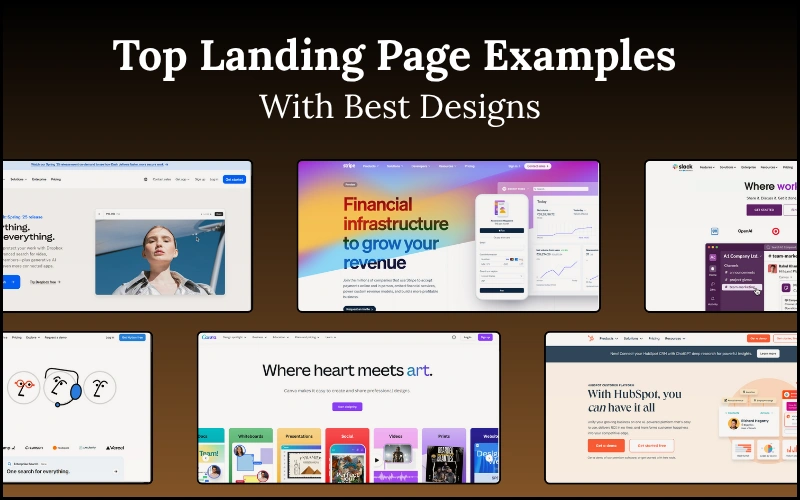
In this blog, we will examine some of the best landing page examples from big brands; these pages are visually appealing and have high conversion rates. Whether you’re a startup, a real estate agent, or simply seeking inspiration, there are numerous ideas to enhance your design.

Table of contents
- What Makes a Landing Page Effective?
- Top Landing Page Examples from Popular Brands
- 1. Dropbox – Simple and Focused on Value
- 2. Airbnb – Real Estate Landing Page Example
- 3. Notion – Best Startup Landing Page Design
- 4. Slack – Powerful Copy with Clean Visuals
- 5. HubSpot – Lead Generation Done Smart
- 6. Stripe – Developer-Friendly & Aesthetic
- 7. Duolingo – Engaging & Colorful
- 8. Webflow – Showcasing Its Own Power
- 9. Canva – Bold Visual Appeal for a Creative Tool
- 10. Zendesk – Clear Problem-Solution Design
- What You Can Learn from These Top Landing Page Designs
- Tips to Create the Best Landing Page Design for Your Brand
- FAQs
- Conclusion
What Makes a Landing Page Effective?
A landing page does one thing exceptionally well: it guides visitors to take a specific action. Signing up, buying a product, and downloading are all actions that should be focused on. Clear messaging is, therefore, essential; together with the headline and copy, it should speak to people about what they are getting and why it matters.
Another essential element that goes into the design of a great landing webpage is a singular CTA (Call to Action), with perhaps a button saying “Sign Up Free” or “Get Started.” The beauty of this CTA is that it grabs attention by far and is very easy to find.
It also should be mobile-friendly. Nowadays, mobile responsiveness cannot be compromised because this generation is accustomed to using mobile browsers. It also needs to load fast; everyone hates waiting.
Equally, it should match your brand. Brand consistency (colors, fonts, tone, etc.) builds trust. So, when all these components come together, you get a landing page that looks great yet functions well.
Check out: 15+ Powerful Reasons Why Are Logos Important (Plus Expert Tips!)
Top Landing Page Examples from Popular Brands
1. Dropbox – Simple and Focused on Value
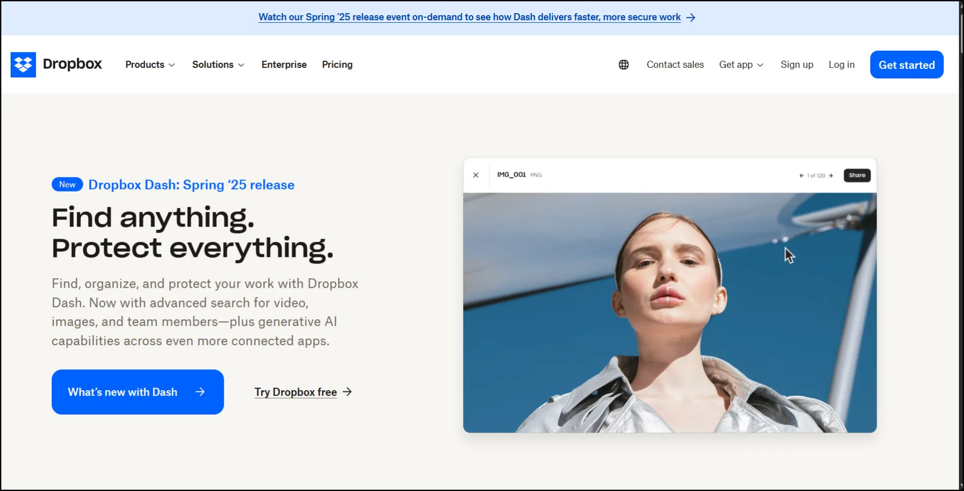
Dropbox’s landing page is an excellent example of clean and focused design. Upon arriving at the page, you are greeted with a vast amount of white space, creating a visually appealing and easy-to-read atmosphere. The headline is concise and to the point, highlighting what the Dropbox service does for you: secure storage and file sharing. A conspicuous call-to-action button invites visitors to “Get Started,” making it as simple as possible for them to take the next step.
It is very minimalist and, at first glance, only shows the essential information. That is how it prevents the visitor from feeling overwhelmed. Dropbox utilizes soft colors, smooth icons, and a modern font to achieve a professional yet friendly aesthetic. It is an intelligent design that conveys value without relying on verbose salesmanship or gaudy graphics. That is what makes Dropbox one of the best landing page examples in 2025.
Check out: 2025’s Best Color Combinations For Website – Make Your Website Stand Out!
2. Airbnb – Real Estate Landing Page Example
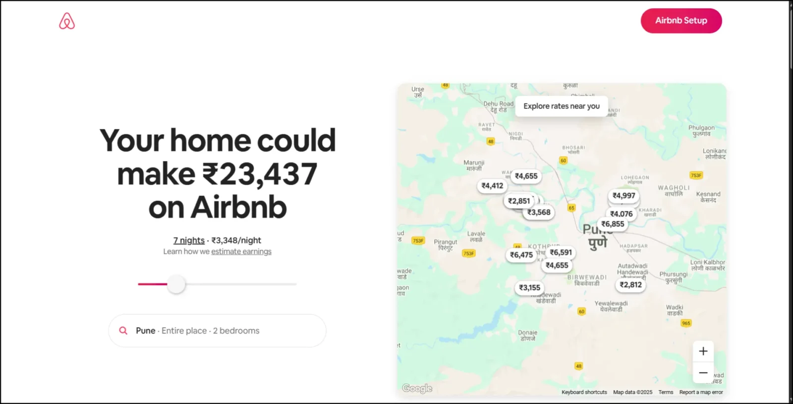
Airbnb’s landing page design is among the best seen. Clean, welcoming, and straightforward, the “Host your home” page is generated upon arrival. The main headline is clear: Promoting hosting your space for making money. Just below, an earnings calculator provides visitors with an immediate attention grabber.
The design features soft colors, friendly images, and ample white space to avoid clutter. What makes this page perfect is its targeted approach to speaking to homeowners. It builds trust with testimonials, real-time earnings examples, and security information.
Alongside these elements lies an essential call-to-action, “Get started,” placed precisely where it’s needed. This real estate landing page is an excellent example of how a combination of design, messaging, and layout can convert visitors into confident hosts.
Also read: What is Voice User Interface? Evolution, Working & Future
3. Notion – Best Startup Landing Page Design
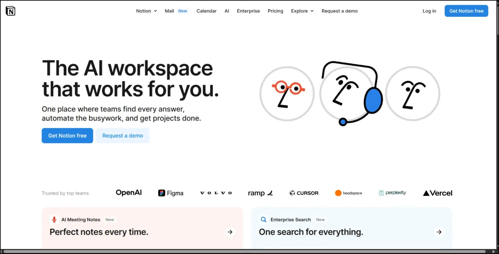
Notion’s landing page makes a great first impression, featuring a strong and elegant design for a startup. The layout is simple and easy to navigate. At the very top is a small headline giving a direct description of what Notion is: “One workspace. Every team.” It is very clear and helpful, indeed, for first-time visitors.
The numerous white spaces allow the design to retain an airy, youthful look. It certainly does not seem cluttered. The primary CTA, “Get Notion Free,” stands out with its starkly contrasting dark button, inviting users to sign up immediately.
Short animations and product demos provide a quick glimpse without a lot of text, allowing users to grasp the essence of the tool in just a matter of seconds. The design is smooth, minimalist, and conversion-driven, making it one of the best startup landing pages to date.
Check out: 12 Interactive Website Examples That Will Wow & Inspire You
4. Slack – Powerful Copy with Clean Visuals
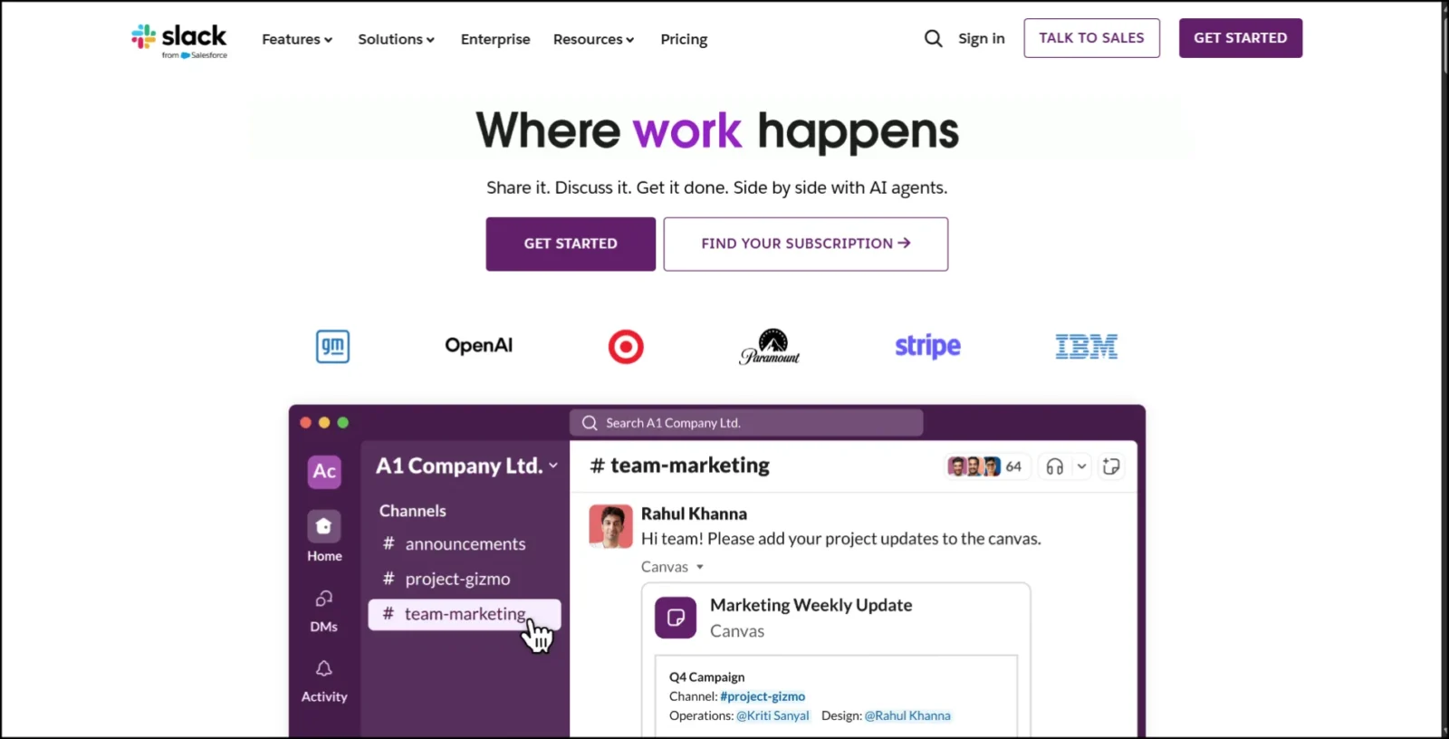
Slack is a classic example of how less is more. As you land on the page, the eye is met with a crisp layout, tons of white space, and the bold colors of their brand. The headline is strong and clear: “Made for people. Built for productivity.” The copy is brief but immediately sets the tone for what Slack is and what it means.
The design is simple and intelligent. There is only one main CTA button, “Try for free,” which helps users determine the next step. Then again, scrolling down also shows pictures of the product in action, allowing teams to collaborate effectively. It also adds social proof with logos of major companies, such as Uber and Netflix.
Speaking for itself, all these features help make one of the top landing pages on the web, according to Slack: easy to read, smooth to navigate, and straightforward in message.
Knowledge bite: 12 Worst Logo Redesigns That Missed The Mark (and Why)
5. HubSpot – Lead Generation Done Smart
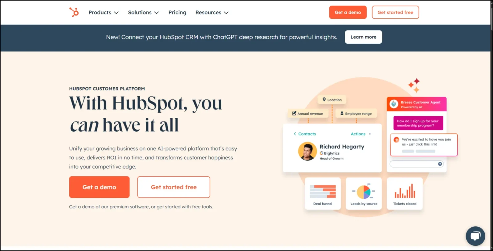
A landing page from HubSpot is an excellent example of innovative, lead-generation-focused design. Right at the beginning, it asserts its strength: “Powerful, easy-to-use marketing tools.” There are clear benefits in the headline. The layout is clean, with ample white space, organized in a way that makes everything look pleasant rather than overwhelming.
Below the section, there is a big bold orange button that screams, “Get a demo” or “Start free.” Since the form is also placed on the homepage, users can take quick action.
It is listed among the best landing page examples due to the combination of superb design with defined goals. It also features trust indicators, such as customer logos and user numbers, which enhance credibility. In essence, this is a highly efficient landing page sample for any brand that is into lead collection and software services.
Discover: Impact of Slow Loading Website and How to Fix It
6. Stripe – Developer-Friendly & Aesthetic
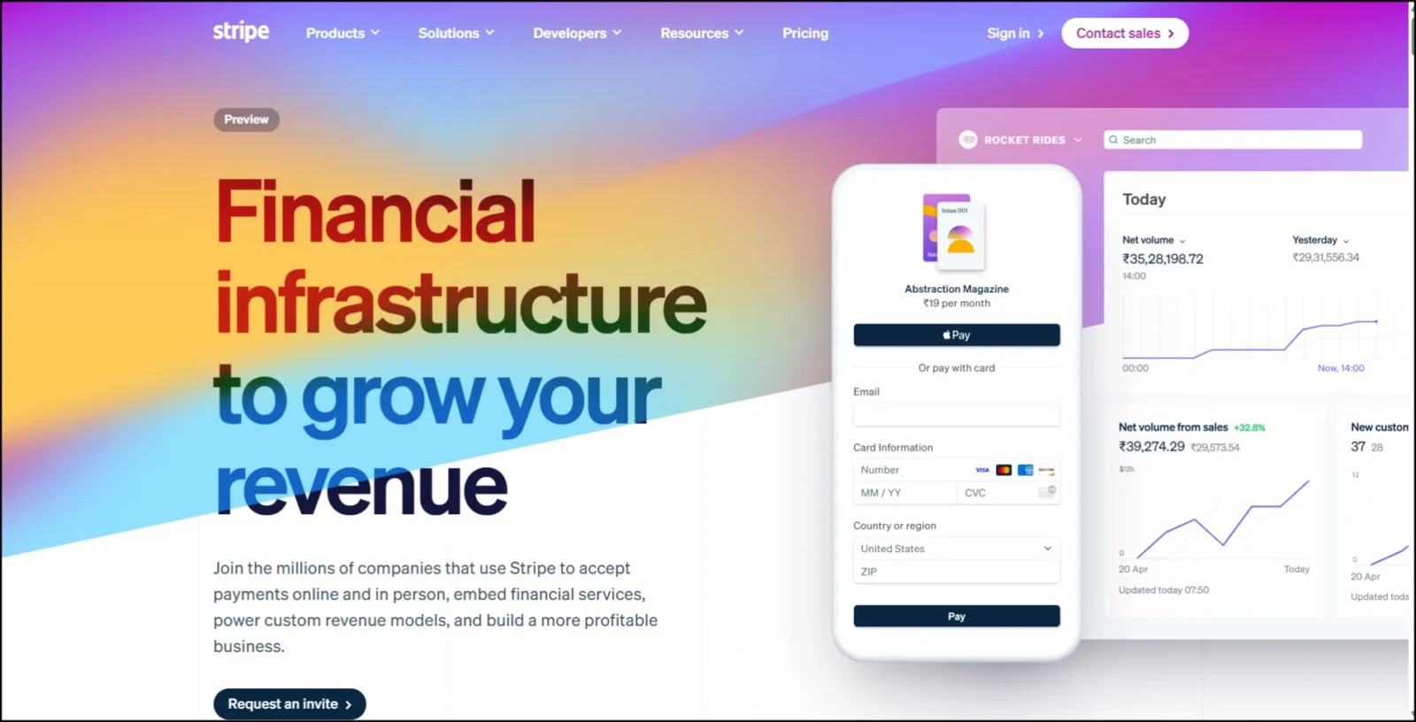
Stripe’s homepage is one of the best examples of excellent landing page design. The very first thing you’ll notice is how clean and modern the whole site feels. With plenty of white space allowing for easy reading, the fonts are kept rather plain, and the colors are kept quite calming, mostly in tones of blue with white and gray, giving the page a professional touch.
What sets this apart is the idea of Stripe communicating with its audience, developers, and businesses. There is a big, bold headline, a concise description, and a call-to-action button at the top, so people are already well-informed on what to do next.
Moving down, you see a glimpse of dashboards and APIs, which exhibit what the product does. This combination of clear messaging, visually appealing product visuals, and developer-centric language is why it is featured among the best landing page examples for tech brands.
Check out: 11 Best WooCommerce Themes for Your Online Store in 2025
7. Duolingo – Engaging & Colorful
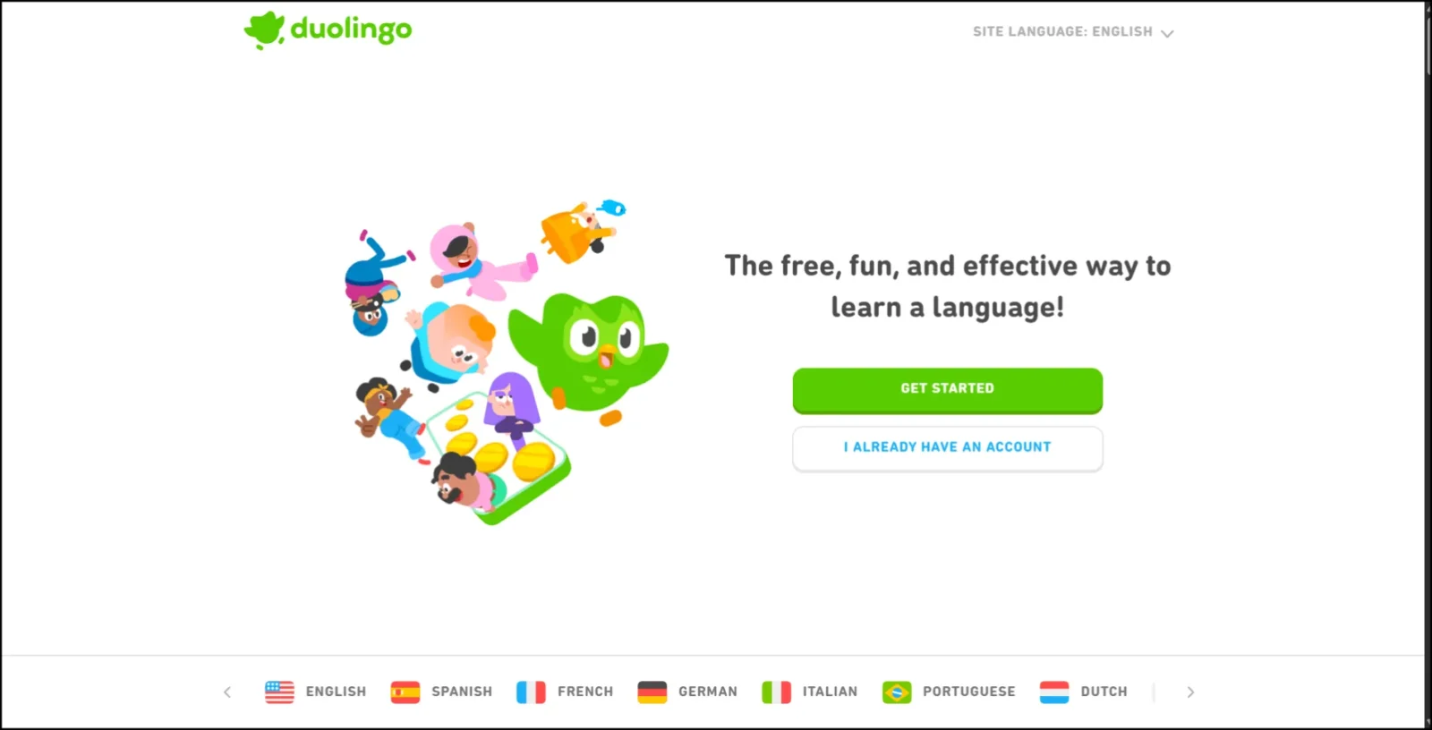
Here is a classic example of how to keep things fun, friendly, and effective. The first thing that greets you when landing on the homepage are the bright colors and playful patterns. It uses its friendly green owl mascot to draw attention to the website and make the brand approachable.
The layout on the landing page is clean and streamlined, with a single thought in mind: to get you learning a language. The “Get Started” action button is large and conspicuously placed in the middle, so everyone knows what to do next. Animation and bold texts combine to make the content enjoyable without being overpowering.
Every bit of color, every icon, and all elements on the page feel inviting, thereby resonating well with the worldwide audience. Simple design choices illustrate the most substantial user experience to be friendly.
Learn: Adaptive Vs. Responsive Design: What Is Best For Your Site?
8. Webflow – Showcasing Its Own Power
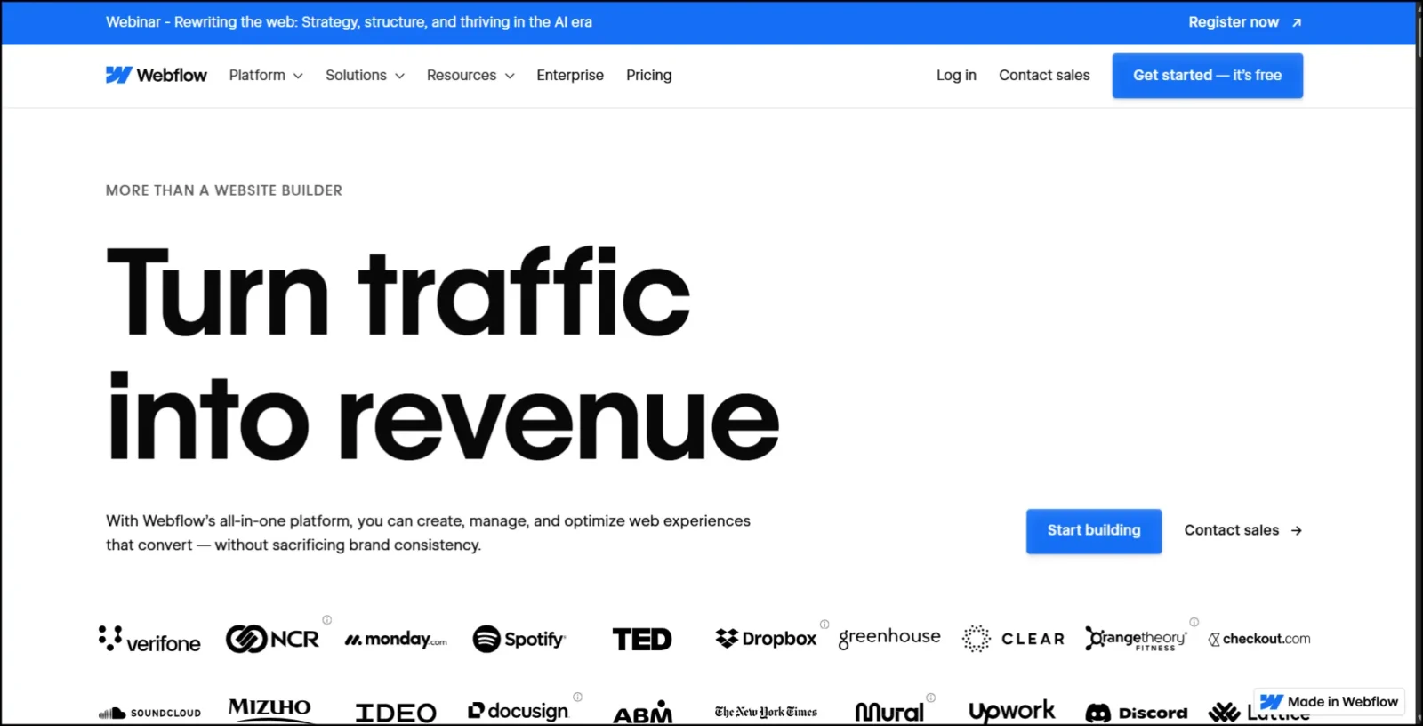
Webflow’s landing page is a prime example of how a brand can use its product to impress its visitors. The presentation is neat, modern, and certainly interactive, providing a showcase of what you can achieve with Webflow without saying a word. Near the top, a bold headline clearly states what the tool does: design websites visually. The background animation is a smooth, subtle presence in the design, captivating attention at just the right level.
The CTA button, labeled “Get started,” appears in purple and is placed in a natural location. More than just aesthetically pleasing, this landing page becomes a live demonstration of what Webflow can do for you. Besides being a classic among the best landing page examples, it educates, sparks curiosity, and, most importantly, encourages you to give the tool a shot through its brilliant maneuvering.
Also read: How To Create a Good User Interface: 15 Essential Tips for UI Designers
9. Canva – Bold Visual Appeal for a Creative Tool
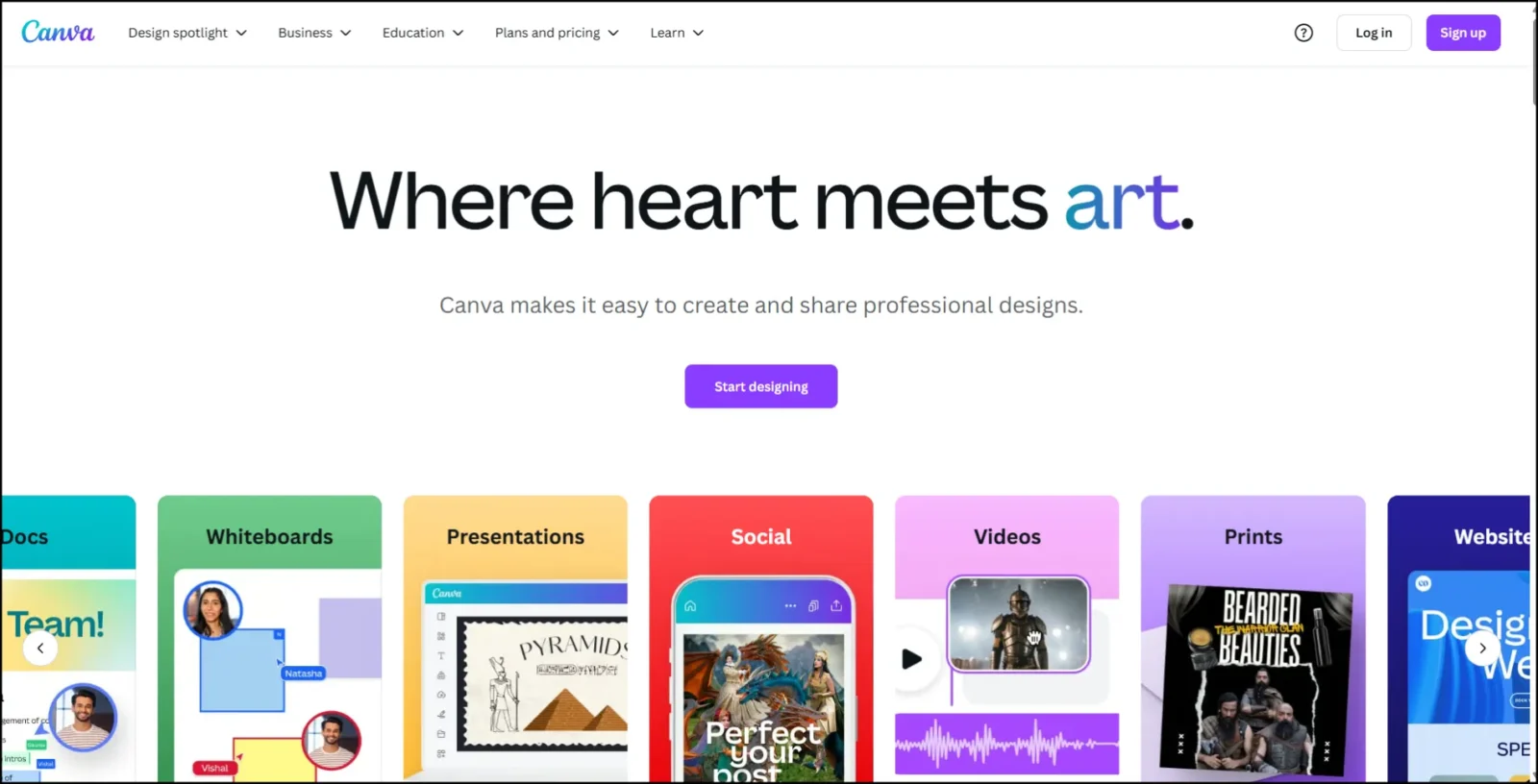
The vibrant colors, clean layout, and friendly design, set against the canvas of Canva’s landing page, give it the sort of charm fitting for the software it is. Upon entering the Canvas homepage, giant and striking words greet you alongside a lucid call-to-action tag: “Start designing.”
Freely flowing with gentle curves and colors, the page captivates with smooth animations, offering a perfect blend for a creative tool. The navigation is easy to use, and primary functionalities are showcased with icons accompanied by just a few lines of text. Canva’s landing page highlights how an attention-grabbing minimalist design can effectively draw visitors into action.
Check out: Why The Website Builder is Popular Today
10. Zendesk – Clear Problem-Solution Design
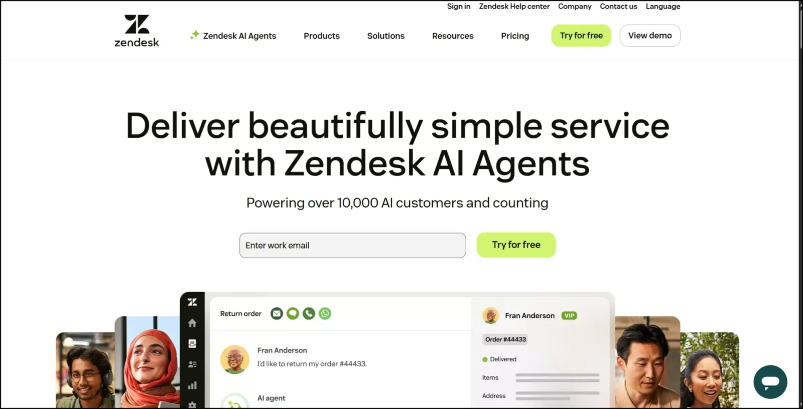
Zendesk’s landing page is a suitable choice for applications that offer a great user experience centered around a significant problem. Right at the header is a short yet powerful statement: Zendesk makes customer service better.
This statement describes the product’s functionality. The interface has a lot of whitespace, making it easy to read. There is only one call-to-action button, an imperatively colored one: ‘Free Trial.’ Further scrolling explains how Zendesk works for various business types while also showcasing logos of genuine brands and providing brief benefits for them.
The entire page adopts a problem-solution approach, first stating the problem and then presenting the product as the solution. The layout ensures easy comprehension, is aesthetically pleasing, and is built for conversion.
Check out: What is UI Design? Understand The Fundamentals Of User Interface Design
What You Can Learn from These Top Landing Page Designs
From these top landing page examples, a few patterns seem obvious. For example, the best pages do not try to say everything at once. They would instead focus on one message, such as “signing up,” “downloading an app,” or “booking a service,” and, hence, make it easy for a visitor to understand the next step.
Second, minimalism is the way to go. The best landing page designs feel uncluttered. They utilize a lot of white space, accompanied by a punchy headline and concise text. This draws attention away from distractions to the most important thing – a button or a form.
Third, the best ones know what they’re talking to. In other words, whether a startup landing page introduces a new tech tool or a real estate landing page helps someone find their dream house, each page speaks directly to the actual needs of users. Accordingly, design, colors, and copy are chosen based on how the audience expects to see them.
The landing pages effectively utilize high-quality images and feature strong calls to action (such as “Get Started” or “Book Now”), maintaining consistency with their brand’s look and feel. If you’re set to create a high-converting page, these examples demonstrate how effective design and compelling messaging can work together to achieve a significant impact.
Whatever sector you are working in, be it tech, design, or real estate, you will benefit from studying these top landing page designs.
Check out: What Are The Qualities Of A Good Website?
Tips to Create the Best Landing Page Design for Your Brand
To create the best landing page design, keep it simple and focused from the outset. An ideal landing page is less about cramming in too much information and more about guiding the visitor to take a single action.
1. One Goal Per Page Should Be Set: There should be one clear goal on your landing page to encourage people to either sign up, make a purchase, or download something. This avoids confusion and increases the likelihood that the audience will click on your primary CTA.
2. Appeal to Your Audience Through Visuals: Use images, colors, and layouts that are characteristic of the target audience. For example, opt for bold visuals if you consider your audience young and creative, but keep it clean and professional if it’s for a business crowd.
3. Split-Test the CTA and Hero Image: Your CTA (i.e., the “Get Started” button) and hero image (the large image at the top) can make a significant difference. Put different ones up and see which one gets you more clicks and sign-ups.
Check out: One Page Website Designs You Need To See : Top 50 Examples
FAQs
1. What is a landing page?
A landing page is a single web page where visitors “land” after clicking a link. It’s designed to prompt people to take a specific action, such as signing up, making a purchase, or downloading something.
2. Why is landing page design important?
Good design helps people quickly understand your message. It also builds trust and makes them more likely to take action. A messy or confusing page can deter visitors.
3. What should every landing page include?
Every landing page should have the following:
- A clear headline
- A short message or offer
- A strong call-to-action (CTA)
- Clean layout and visuals
- Mobile-friendly design
4. What’s the difference between a homepage and a landing page?
A homepage is like the front door of a website, and it has many links and options. A landing page is focused on a single goal, such as getting someone to sign up or make a purchase.
5. Can small businesses also use landing pages?
Yes! Landing pages are ideal for small businesses, startups, and freelancers alike. They help you grow your email list, sell products, or promote services with a clear message.
Check out: Minimalist Web Page Design: Principles, Best Practices And Examples
Conclusion
The first thing that makes landing pages effective at transforming visits into conversions is that a well-built landing page is eye-catching, conveys its message clearly, and presents viewers with an effortless action to take, such as registering, clicking the buy button, or contacting you.
In this blog, we examined top landing page examples from various brands and saw how great designs, clean layouts, and strong calls to action can significantly improve results.
But these landing pages were smart, too. Every landing page, from real estate landing page examples to the best startup landing pages, taught us a thing or two.
Now it’s your turn to build one that converts! Use the tips and the examples as a guide, and build what works for you and your audience.
If you find this blog helpful, check out more: